In order for we to sent out a successful message to the audience, out graphic information should not be too complicated to interpret. Tutfe, E. has also mentioned that Graphical display should:
- Show the data
- tell the truth
- help the viewer to think about the information rather than design
- encourage the eye to compare the data
- make large data sets coherent
(cited from http://classes.ninabellisio.com/GD3371/tufte.pdf)
As far as i am concern, other than for easy understanding to the audience, information graphics also a medium used in order to give a more clear true information and avoid confuse for the public for a specific subject. In order for we to sent a message using graphics, we should know the advantages and disadvantages before selecting the graphics information that we wanted to use.
A line Graph - show specific values of data but only best with two variables and it best in showing the trend over time.
A bar graph - uses to display changes in magnitude which is easy to compare and contract data.
A pie chart - best in representing category values and presenting percentages.
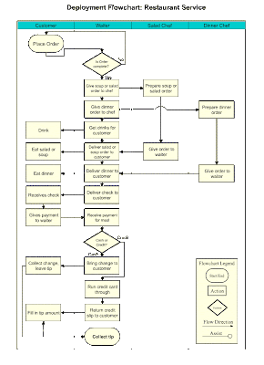
A flow charts - shows a movement and progression from one stage a category to another.
but what happen if something wrong in the flow chart and require changes? its more difficult because you have to change the others if you change one of them. I suppose i'll be in trouble if i need to change something in this flow chart:
Pictograms - visually stimulating and its best in providing a clear and simple explanation.
Other factors which should be took into consideration is what the brain can see through our human senses such as eyes. The factors are Color, form, depth and movement. Thus its important for the information graphic designer to know about what color should not be subtract or add for the graphics, in what form should it be, how the depth works and which movement will be suitable. As mentioned in Visual communication: images with messages:
"Color, form, and depth join movement to constitute the principal of images that make the cells in the visual cortex responds quickly to a stimulus" Lester, P.M (2006)
From all the graphic information above proved that graphics are used in order to communicate with others - as a medium to sent a message or as an explanation for a subject.
REFERENCE:
- Lester, P.M, (2006), Visual Communication: images with messages, Holly J. Allen
- cited from (http://classes.ninabellisio.com/GD3371/tufte.pdf)


Tiada ulasan:
Catat Ulasan